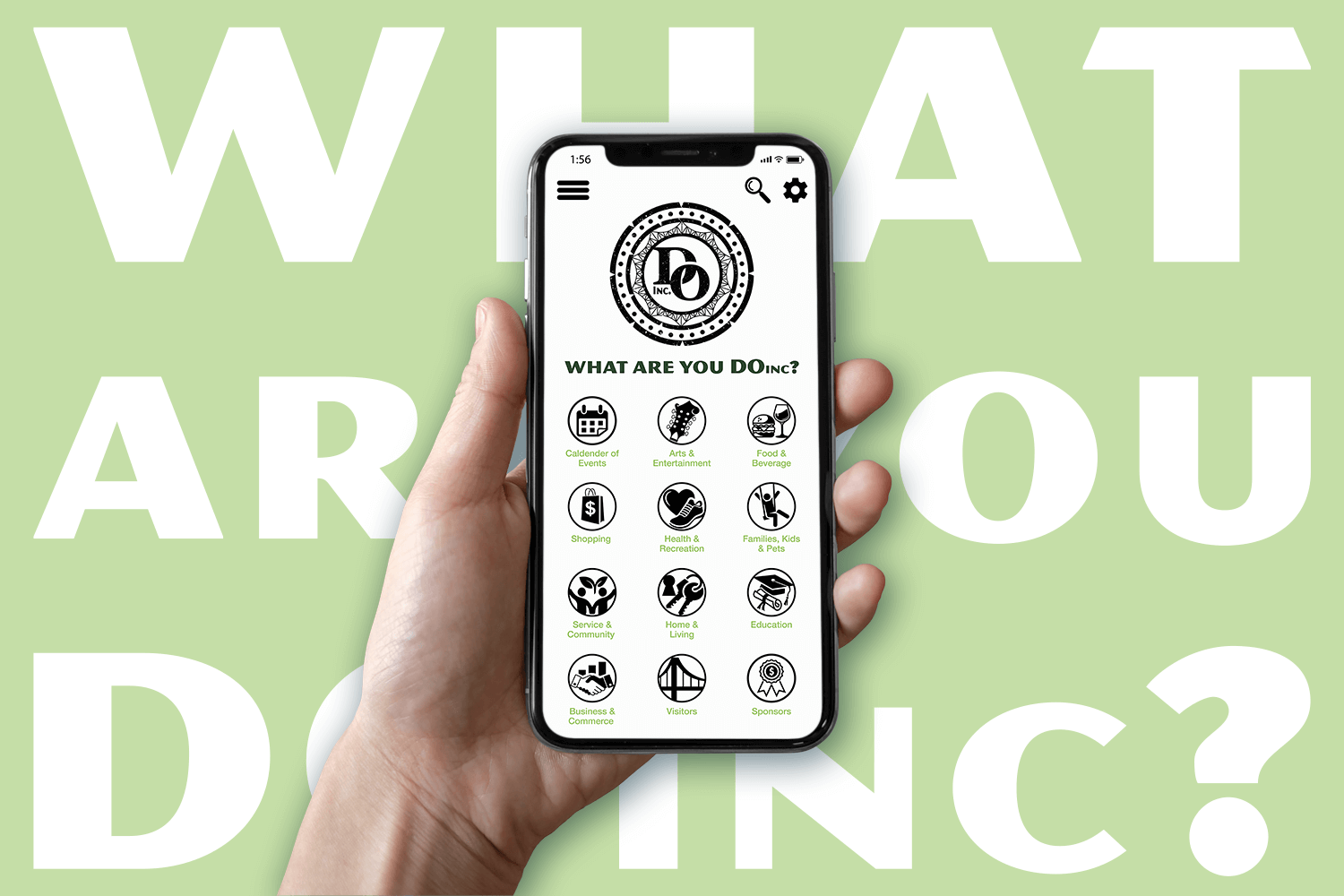

Downtown Owensboro Incorporated started as a simple idea: a one-stop hub where you can see all of the news, events, services, and other things going on in Owensboro, KY. The goal was to equip residents and tourists with all the information they need to roam the city through an app. Owensboro's downtown district had seen major expansion in the past decade, and with that expansion came more events, restaurants, stores, bars, etc. The two founders of the business saw potential to tap into this and provide an easy, quick way to access all of that information right in front of you at any time.
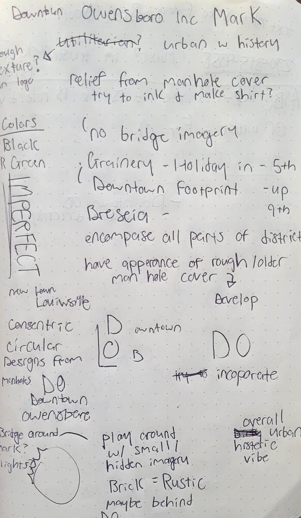
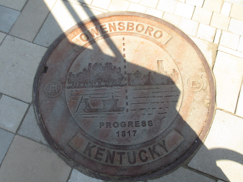
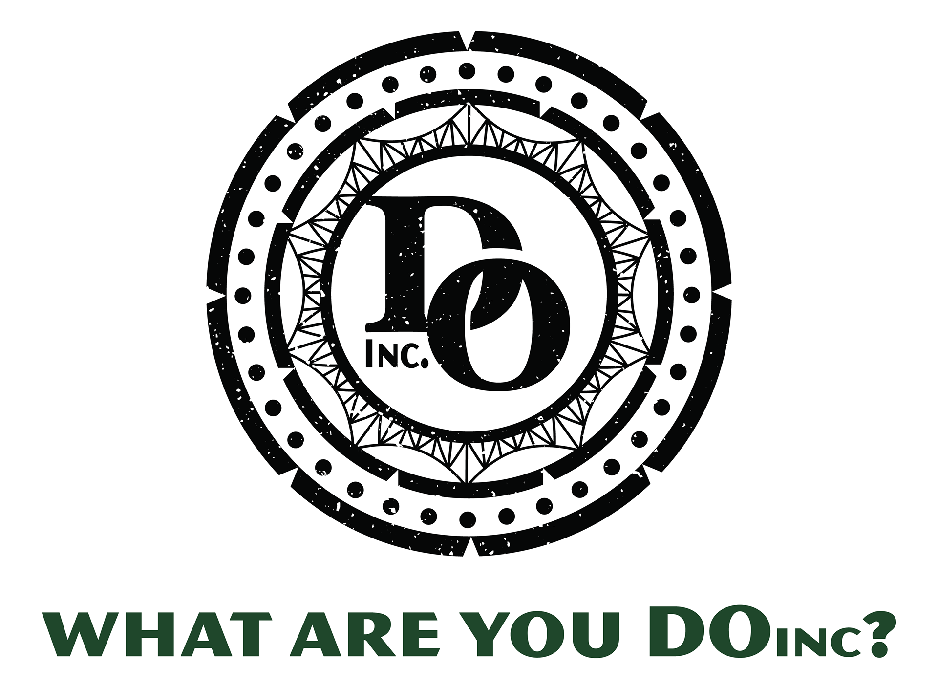
I was brought on this project very early in its development. They had a basic foundation, but many details, such as a full list of the categories to divide all of this information into, were not finished yet. One of the first things they showed me was a picture of an Owensboro manhole cover with a specific design on it. These have been throughout the city for decades, but not something people often notice. They wanted to play into this rustic/well-worn style and create a logo that paid homage to this design and the city's history. We quickly decided to focus on abbreviating Downtown Owensboro Inc into DOinc and use "What are you DOinc?" as a tagline in the marketing. I had the idea to tie imagery of Owensboro's historic blue bridge into the design as well by having a truss pattern along the outside.

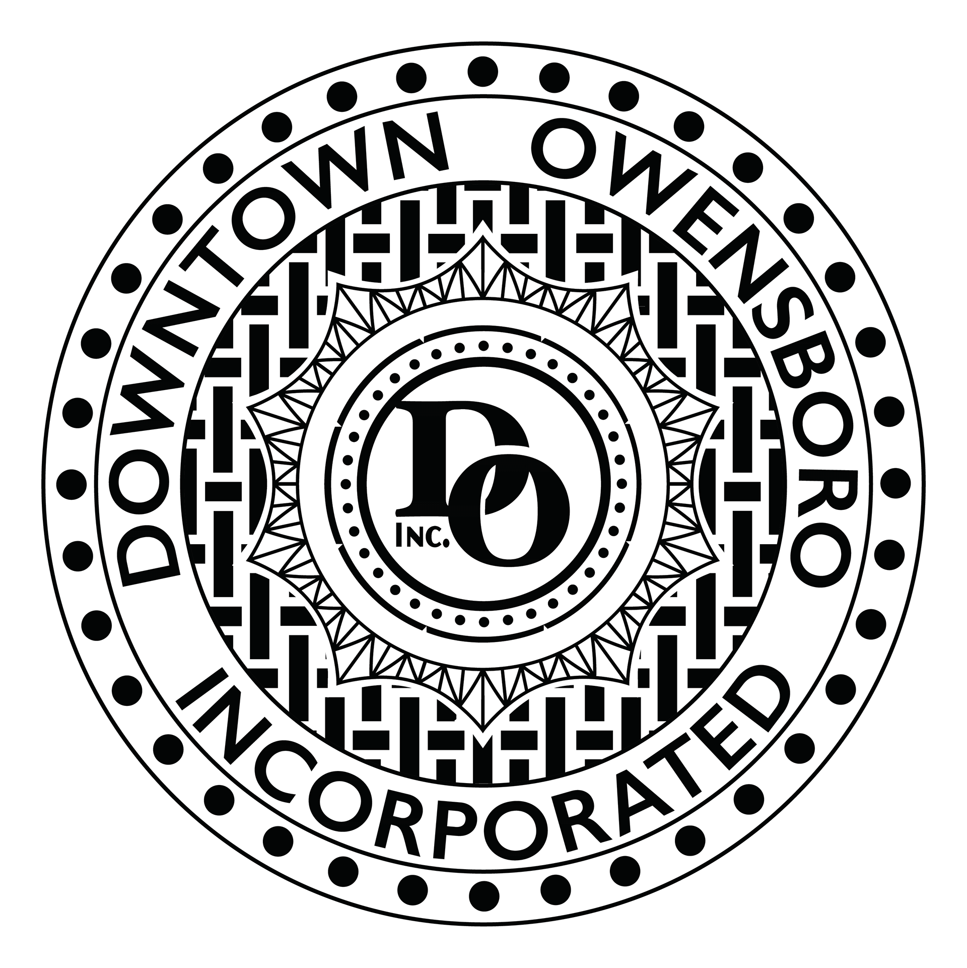
We landed on a modified version of the font Hoefler black for "DO" and MVB Magnesium for "Inc." which provided a nice contrast to the larger, traditional serif. We explored a version of the logo where there was a rectangular pattern that mimicked a pattern you would find on a normal manhole cover. We quickly realized this was too much and condensed it down while still keeping manhole cover elements like a dotted circle with thicker rings around it.
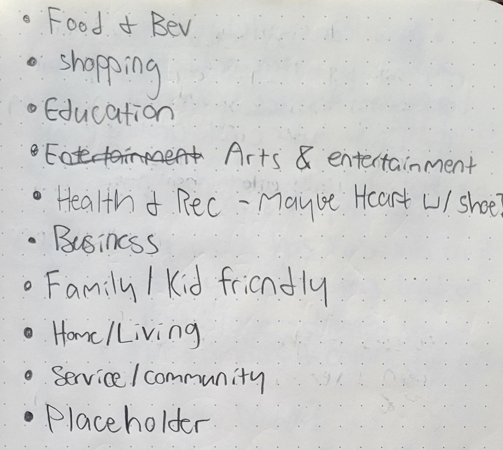
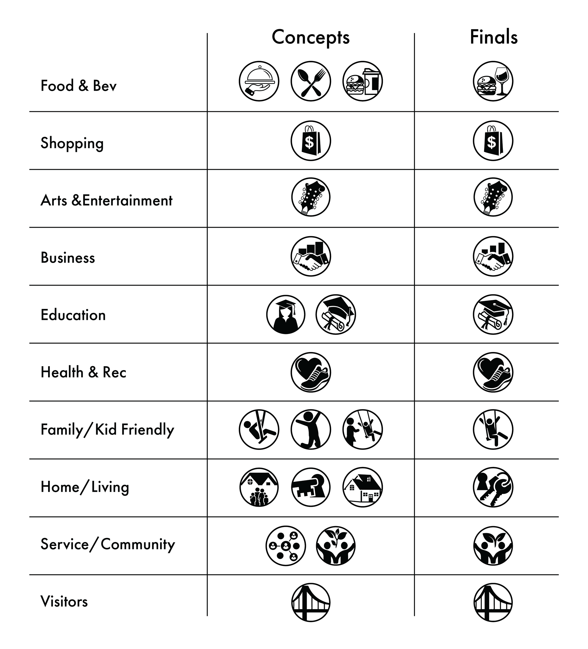
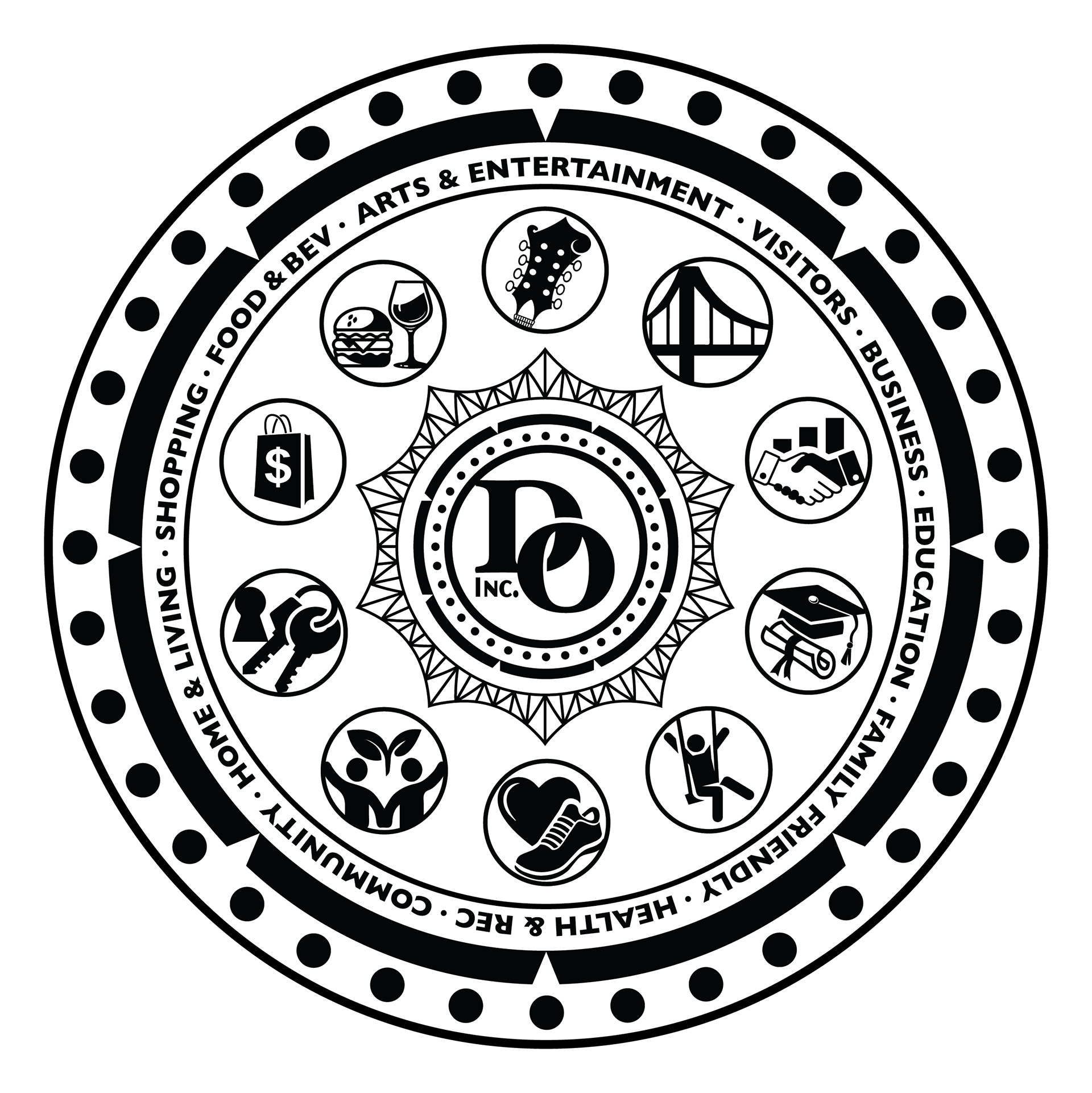
The icons were another large part of this project. Since the app dealt with so much information, it was very important for that information to be organized properly. We decided to split that info into categories each with its own icon that would be presented on the app. I started creating flat and clean concepts that had to pair together well as a family and easily and effectively represent their respective category. Below are the various concepts we went through before we landed on the final ten. At one point we had the idea of having the front page of the app be a giant manhole type wheel with all ten icons that could be clicked on. This was pretty quickly scrapped due to it being far too much information on a small screen.
We knew we wanted to keep the color palette minimal and primarily use black with an accent color. I played around with a few different colors that fit this rustic, worn theme we had set up, including a rusty brown and a few washed-out shades of blue. We landed on a deep dark green and a complementary lighter green for the color palette. This decision came from the Green River, a tributary of the Ohio River on which Owensboro's riverfront is located. This name has historical significance throughout the city, and other businesses in the city, like Green River Distilling Co., use it.
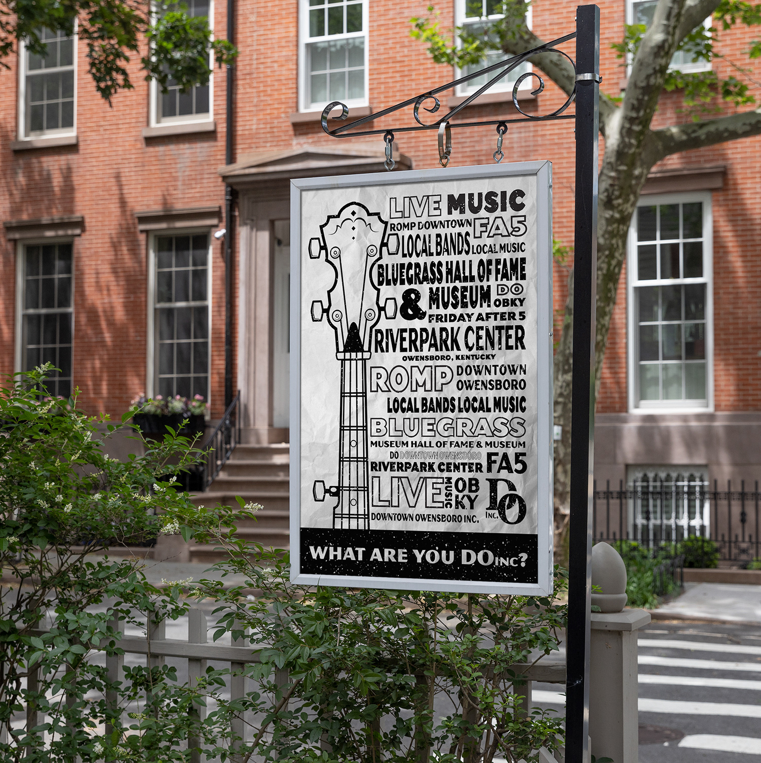
I assembled all of the completed assets and created a front-end mockup for the homepage of the app and a social media banner to promote it. I supplied the outside source that my client used to create the app and website with all necessary assets, including graphics, fonts, colors, and general guidelines. The business, app, and website launched in July of 2022 and have since found their place within the community, providing helpful information and often sponsoring events around the city as well. You can find prints and stickers of the logo with a QR code all around the city in restaurants and other buildings. During the launch, we put up a poster I designed referencing many of the businesses, events, and other things having to do with the arts and entertainment section of the app. I'm glad I could be a part of something that genuinely does help the city while referencing its rich history.