Overview
A full retail experience redesign for Galen College of Nursing’s 20+ campus store system, focused on increasing engagement, consistency, and sales.
As part of the core team shaping the direction of the experience, I led the ideation and execution of a comprehensive suite of assets, including apparel design, campaign photography, in-store signage and wayfinding, a large-scale EGD wall installation, a custom icon system, and the overall spatial layout of the store.
The Opportunity
Each campus at Galen College of Nursing operates a retail store offering scrubs, apparel, and branded merchandise. As the institution has rapidly expanded over the past decade, with now 20+ campuses around the United States, the retail experience became inconsistent, outdated, and disconnected from the brand itself.
The stores lacked cohesion, a clear merchandising strategy, and a defined visual identity. Fixtures, layouts, and visual elements varied from campus to campus, resulting in a fragmented and underwhelming experience.
This presented an opportunity to reimagine the stores as a unified retail system. One that better reflected Galen’s modern, student-focused brand while creating a more engaging, visually compelling environment designed to increase foot traffic and drive sales.
The Pure Galen Store pre-renovation
The Approach
As part of the core team leading this project, we started by auditing the store experience across multiple campuses to identify what was working and what wasn’t.
We focused on building a scalable retail system that would work across different store sizes while maintaining a consistent brand experience. With Galen College of Nursing’s Louisville, Kentucky campus serving as headquarters and having one of the highest in-store foot traffic, we used it as a pilot to refine the new direction before expanding across our campuses.
We centered the redesign around four key areas:
Spacial consistency
Visual identity
Merchandising strategy
Overall atmosphere
The System
Building a Cohesive Foundation
Across campuses and even individual stores, fixtures, shelving, mannequins, and signage were inconsistent, adding to a disconnected experience.
We standardized these core elements and selected styles that elevated the presentation while working across a range of store sizes.
Example of inconsistent fixtures and signage pre-renovation
Merchandise
We analyzed product performance alongside broader apparel trends within the industry to better align the store’s offerings with what students actually wanted to wear.
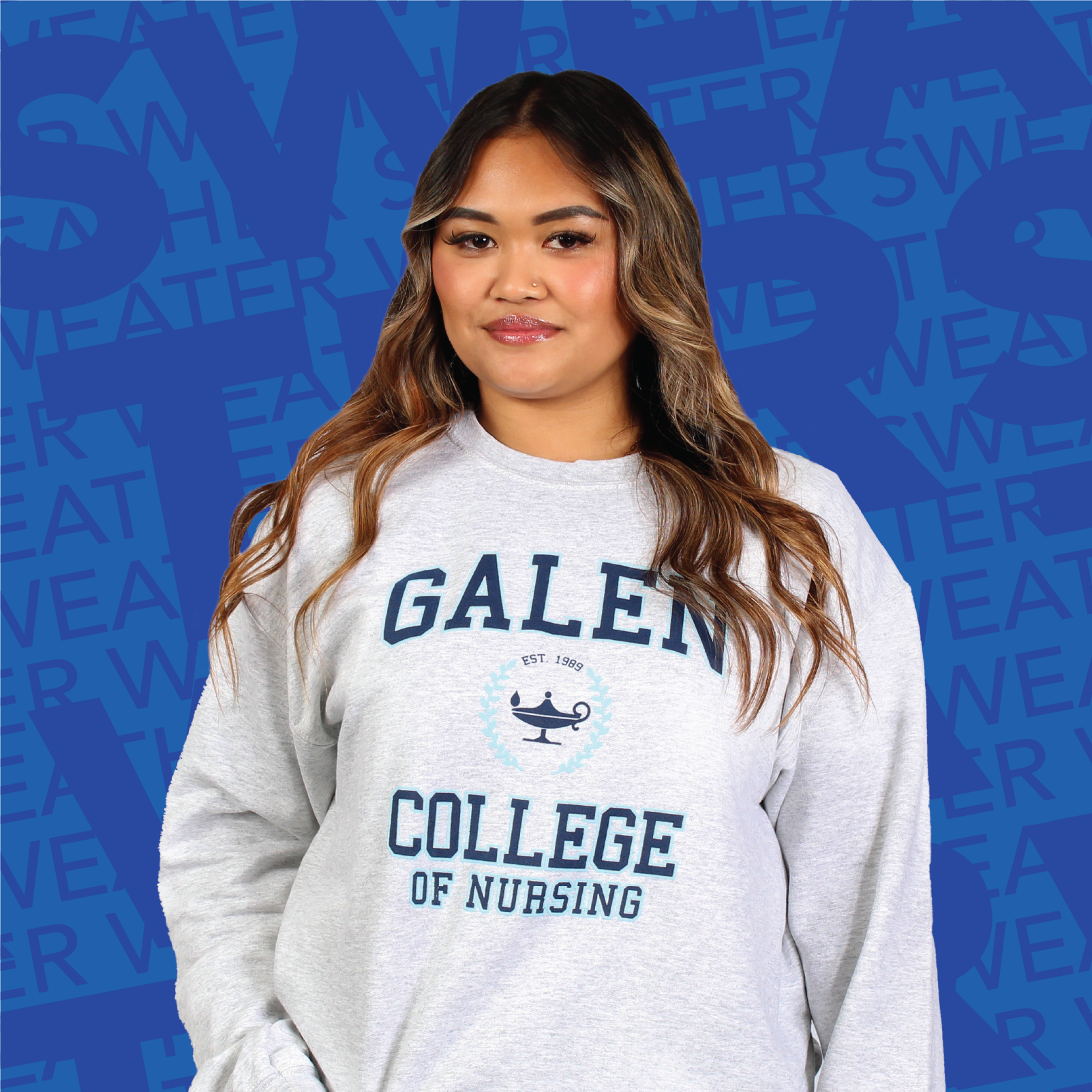
This led to us phasing out underperforming items and introducing new apparel based on our analysis. Some of these quickly became top sellers, including my collegiate-style sweatshirt design.
The new, best-selling collegiate-style sweatshirt
Bringing the Brand Into the Space
The stores felt sterile. Other than the merchandise itself, there was minimal branding, no photography, and nothing pulling students in.
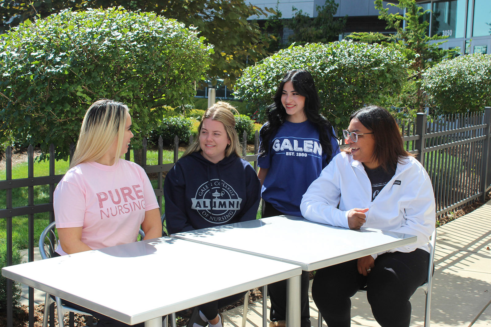
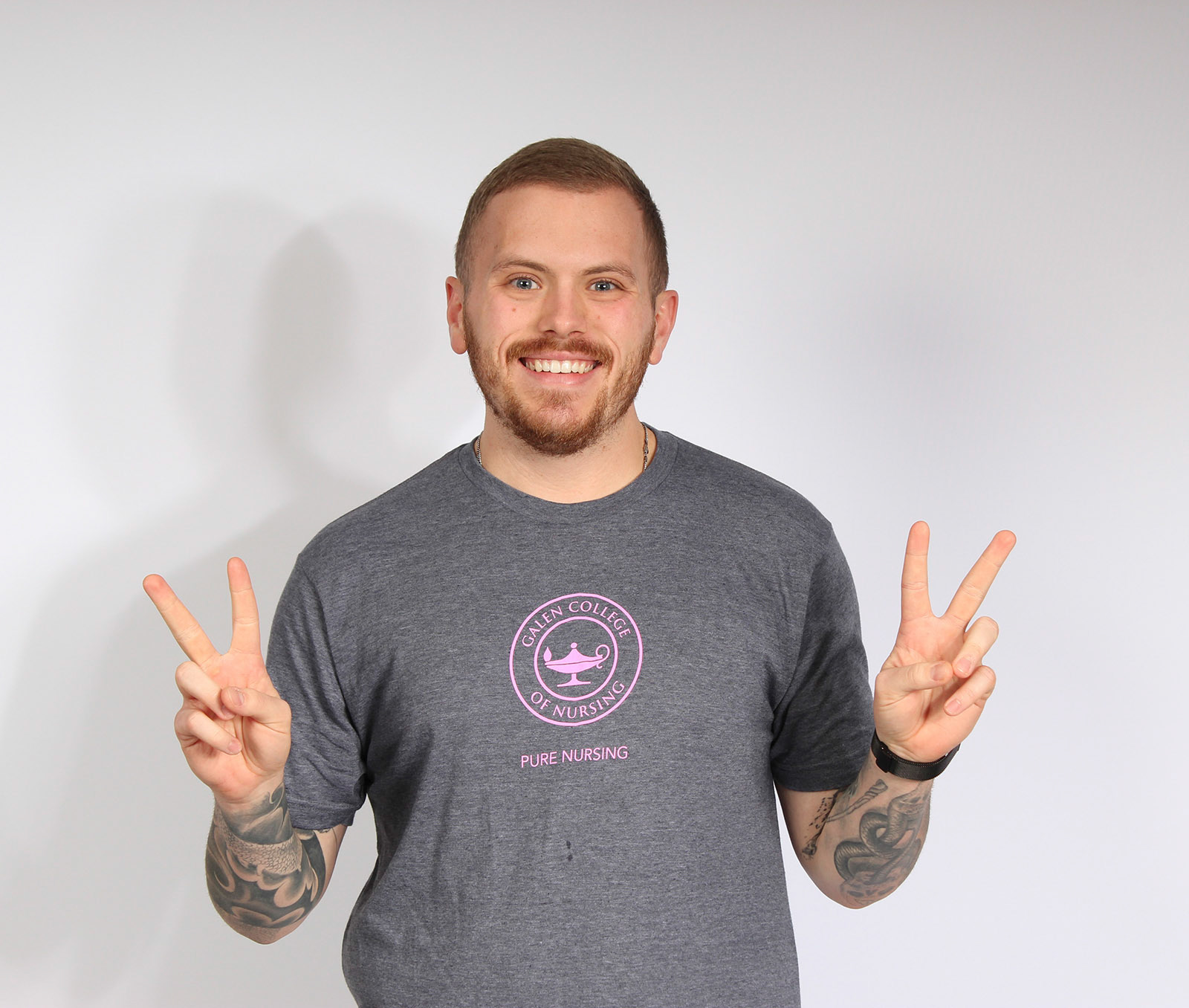
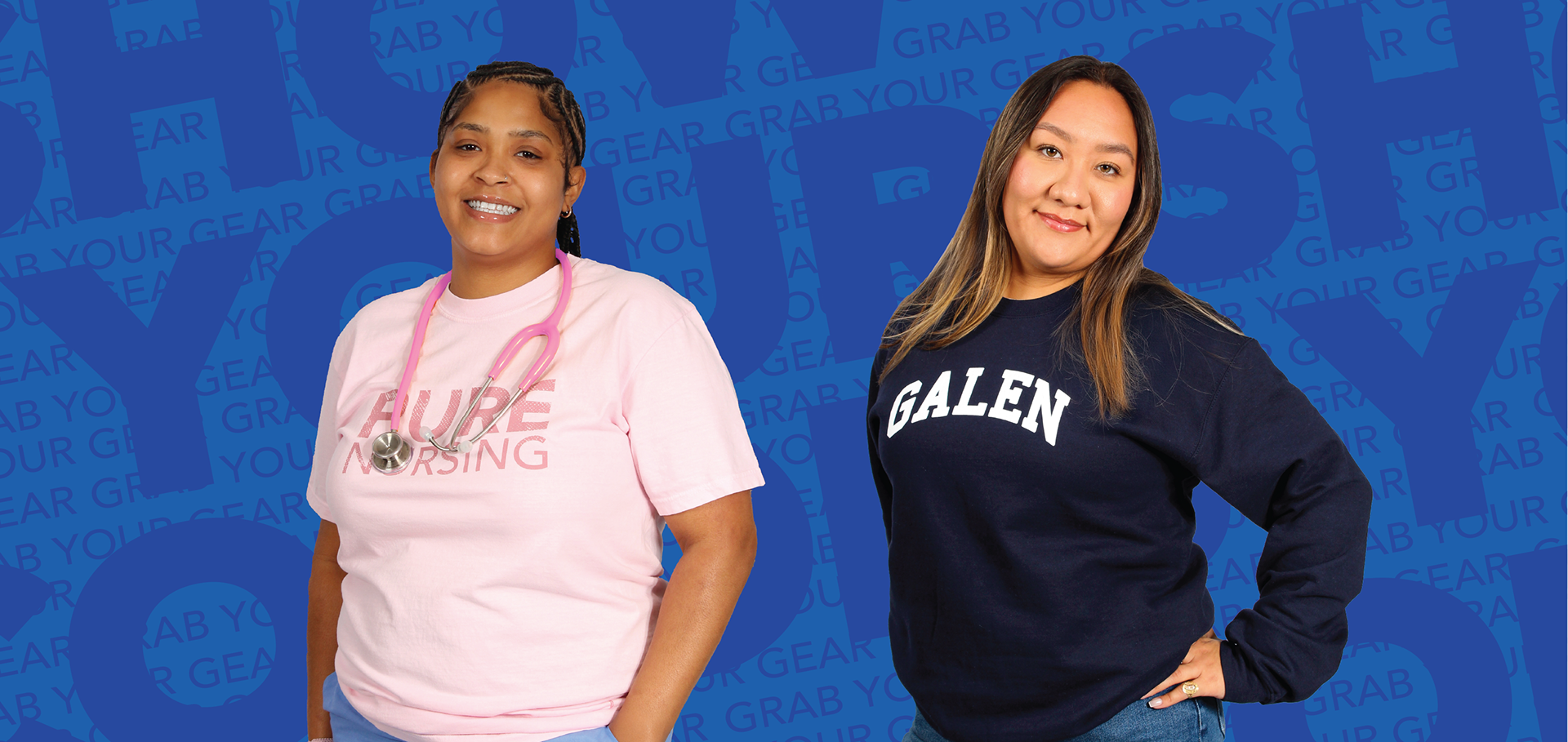
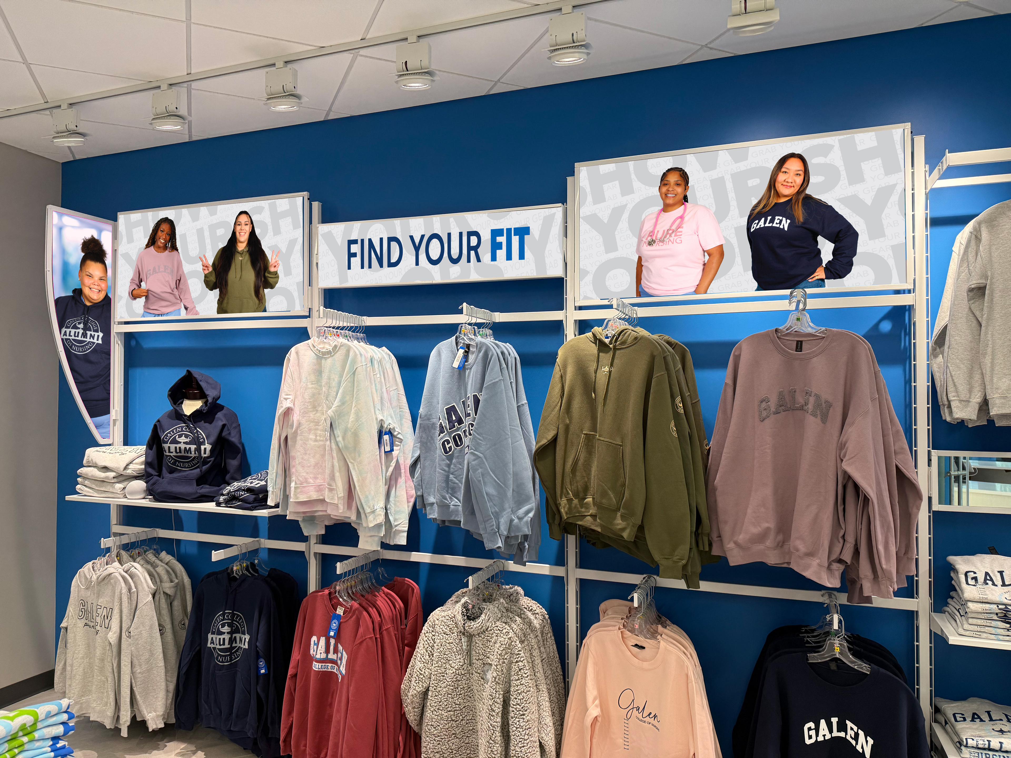
I directed a photoshoot capturing portrait and lifestyle photography featuring Galen students wearing the new merchandise. Students were happy to participate (Free merch helped, too!), and it added a layer of authenticity to the final product.
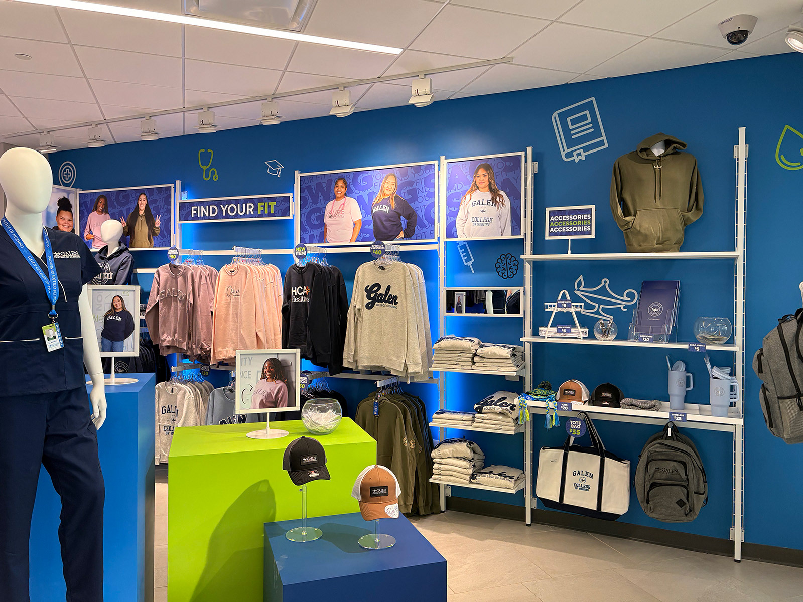
We paired this photography with a distinct typography and layout treatment, and this became the foundation for our in-store visual system, which we applied across wayfinding, promotional signage, and other assets.











Environmental Graphics
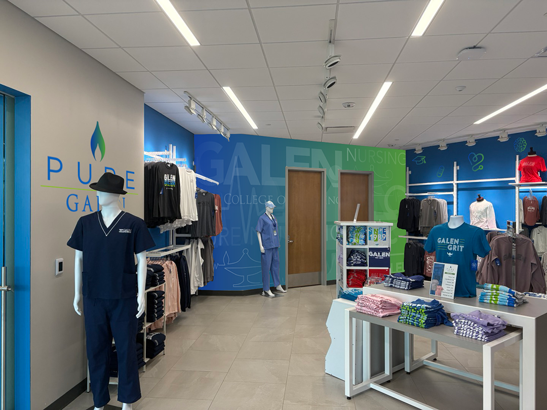
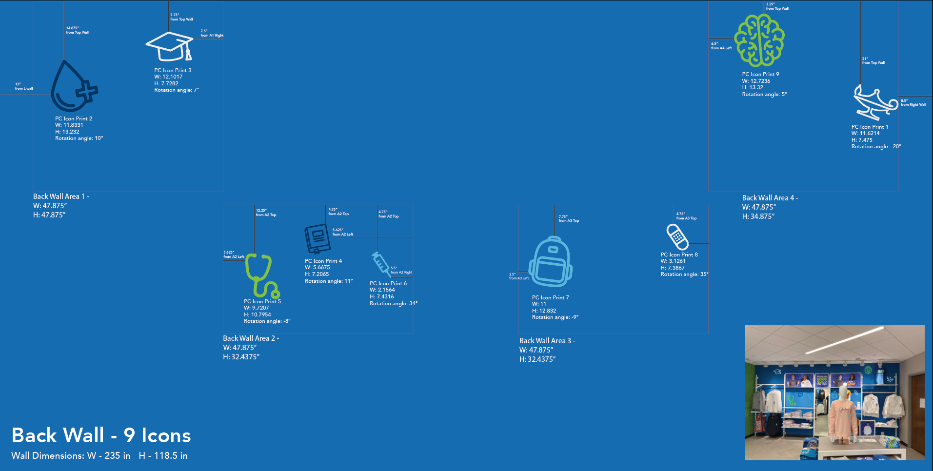
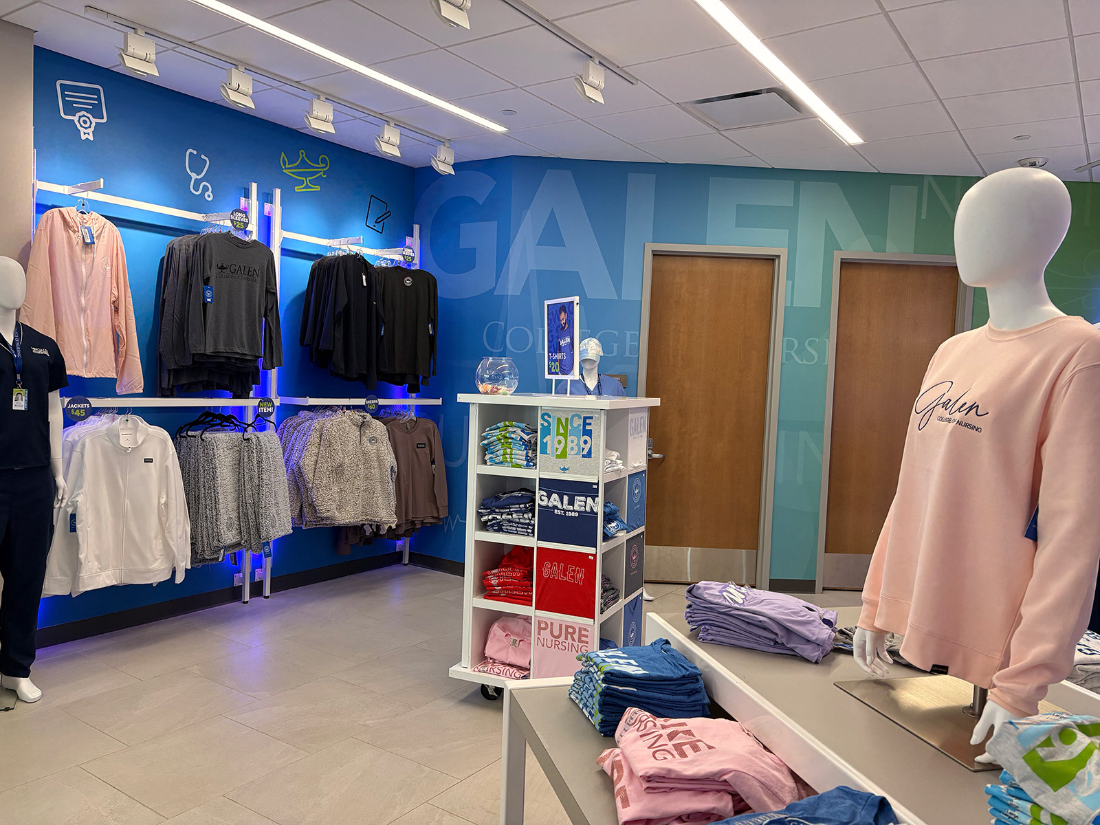
To add to the transformative experience of walking into the store, I designed two other environmental graphic assets. The first was a large-scale environmental graphic that spanned an entire wall. This graphic brought multiple brand elements together to create something unique to the Louisville store.

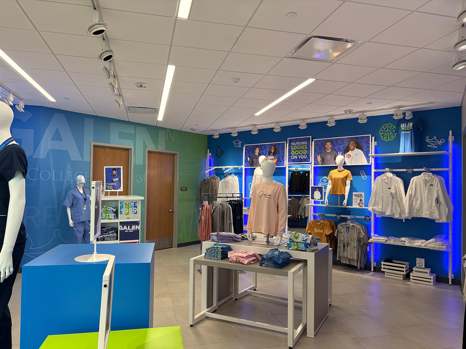
Secondly, I developed a custom icon system as part of Galen’s updated brand guidelines. This system was designed to be flexible with variety in scale and color, so it could be applied dynamically across the walls of each store.

Atmosphere
To top this transformation off, we updated lighting fixtures and curated music to make the space feel less like a supply shop and more like a retail environment.
To validate the direction, we conducted a feedback phase with Galen College of Nursing’s marketing team, where we reviewed design concepts and in-store mockups to ensure the experience aligned with both the brand and the student perspective.
The Rollout
Bringing the System to Life
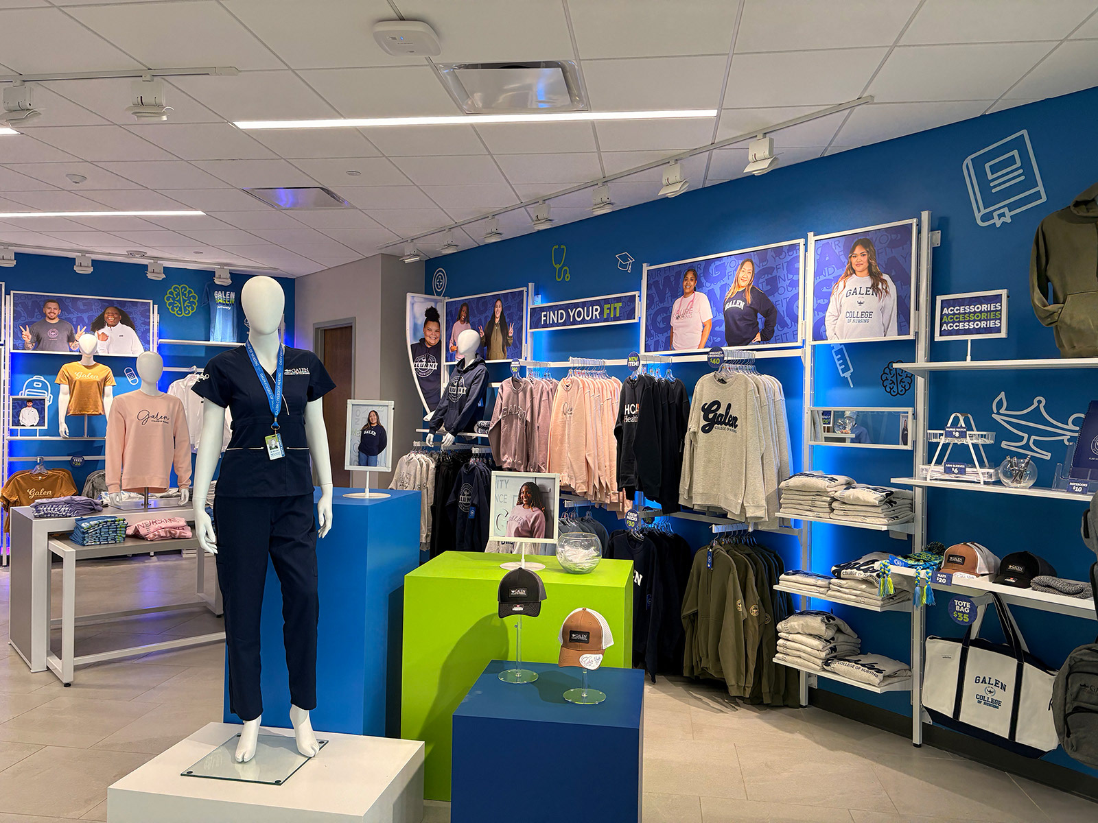
Over the course of a few weeks, the full system was implemented at the Louisville campus store. As each element was put into place, the space shifted into a cohesive, branded retail experience.

Scaling the Experience
Following the positive feedback from the pilot, we began rolling out the system to additional campuses. While still in process, early implementations demonstrate how the framework adapts to different store layouts while maintaining a consistent look and feel.
Impact & Takeaways
Results have shown an increase in store engagement and sales. Student response played a key role in validating the direction. The integration of student photography throughout the space was a consistently noted highlight. That was the goal from the start: translating Galen College of Nursing’s authentic student-first approach into the store environment.
This project was a massive undertaking with moving parts across branding, EGD, photography, and print. Not only was it fun, but it reinforced the importance of building a design system that was flexible and intentional, ensuring it could adapt across campuses while staying cohesive.


